Matplot library Python Examples | Line chart | Bar Chart | Scatter Plot | Area Plot | Histogram | Pie chart
Matplotlib is the most popular data visualization library in Python.
It allows us to create figures and plots, and makes it very easy to produce static raster or vector files.
Matplotlib library Python Examples
- Line Chart
- Scatter Plot
- Pie Chart
- Bar Chart
- Histogram Plot
- Area Plot
ALSO LEARN What is Visualization of data in Data Science?
Open anaconda
Launch Sypder
Launch Sypder
 |
| Anaconda Navigator |
1. Line chart
PROGRAM 1
import matplotlib.pyplot as plt
plt.plot([1,2,3,4],[5,4,3,2])
plt.show()
OUTPUT
 |
| Line Chart Python Example |
PROGRAM 1
import matplotlib.pyplot as plt
years = [2010, 2011,2012,2013,2014]
production= [300,400,840,860,900]
plt.plot(years,production)
plt.title('Production of grains over years')
plt.xlabel('years')
plt.ylabel('production')
plt.show()
OUTPUT
 | |
|
PROGRAM 2
import matplotlib.pyplot as plt
years = [1,2,3,4,5]
production= [20,30,40,60,80]
plt.plot(years,production)
plt.title('Production of grains over years')
plt.xlabel('years')
plt.ylabel('production')
plt.xticks([10,20,30,40,50])
plt.yticks([0,2,4,6,8])
plt.show()
OUTPUT
 | |
|
2. Scatter Plot
PROGRAM 1
import matplotlib.pyplot as plt
years = [2010, 2011,2012,2013,2014]
production= [300,400,840,860,900]
plt.scatter(years,production)
plt.title('Production of grains over years')
plt.xlabel('years')
plt.ylabel('production')
plt.show()
OUTPUT
 | |
|
PROGRAM 2
import matplotlib.pyplot as plt
years = [1,2,3,4,5]
production= [20,30,40,60,80]
plt.scatter(years,production)
plt.title('Production of grains over years')
plt.xlabel('years')
plt.ylabel('production')
plt.xticks([10,20,30,40,50])
plt.yticks([0,2,4,6,8])
plt.show()
OUTPUT
 | |
|
3. Pie Chart
PROGRAM
import matplotlib.pyplot as plt
Division = [1,2,3,4,5]
India =[7,8,6,11,8]
Pakistan = [2,3,4,3,5]
Bangladesh =[7,8,7,6,2]
China = [8,5,7,8,13]
slices = [9,2,1,13]
activities = ['India','Pakistan','Bangladesh','China']
cols = ['m','b','r','c']
plt.pie(slices,
labels=activities,
colors=cols,
startangle=90,
shadow= True,
explode=(0,0.1,0,0),
autopct='%1.1f%%')
plt.title('Pie Plot Example')
plt.show()
OUTPUT
 | |
|
4. Bar Chart
PROGRAM
import matplotlib.pyplot as plt
product=["shampoo","soap","conditiner","brush"]
sale= [204,340,402,620]
plt.bar(product,sale)
plt.title('Sales of Products')
plt.xlabel('proucts')
plt.ylabel('sales')
plt.show()
OUTPUT
 | |
|
5. Histogram
PROGRAM
import matplotlib.pyplot as plt
population_age = [20,65,72,43,31,62,34,42,42,4,52,102,95,85,55,110,120,70,65,55,111,115,80,75,65,54,44,43,42,48]
percent = [0,10,20,30,40,50,60,70,80,90,100]
plt.hist(population_age, percent, histtype='bar', rwidth=0.8)
plt.xlabel('age groups')
plt.ylabel('Percentage')
plt.title('Histogram Example')
plt.show()
OUTPUT
 |
| Histogram Python Example |
6. Area Plot
PROGRAM
import matplotlib.pyplot as plt
n = [1,2,3,4,5]
a1 =[7,8,9,11,10]
a2 = [2,6,4,3,8]
a3 =[7,8,7,2,2]
a4 = [8,5,7,8,13]
plt.plot([],[],color='c', label='a1', linewidth=5)
plt.plot([],[],color='k', label='a2', linewidth=5)
plt.plot([],[],color='r', label='a3', linewidth=5)
plt.plot([],[],color='m', label='a4', linewidth=5)
plt.stackplot(n, a1,a2,a3,a4, colors=['c','k','r','m'])
plt.xlabel('x')
plt.ylabel('y')
plt.title('Stack Plot')
plt.legend()
plt.show()
OUTPUT
 |
| Area Plot Python Example |
PROGRAM
from matplotlib import pyplot as plt
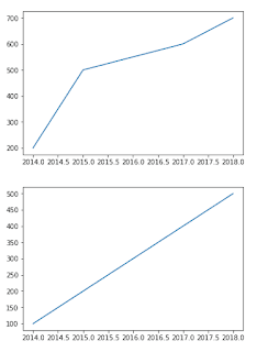
years=[2014, 2015, 2016, 2017, 2018]
Brazil=[200, 500, 550, 600, 700]
America=[100,200,300,400,500]
plt.plot(years, Brazil)
plt.show()
plt.plot(years, America)
plt.show()
y=[1, 2, 3]
plt.plot(y)
plt.ylabel("population")
plt.xlabel("year")
plt.show()

PROGRAM
from matplotlib import pyplot as plt
years=[2010, 2011, 2012, 2013, 2014]
Mumbai=[290, 400, 650, 600, 790]
Delhi=[150,290,350,420,570]
plt.bar(years,Mumbai)
plt.bar(years,Delhi)

years=[2014, 2015, 2016, 2017, 2018]
Brazil=[200, 500, 550, 600, 700]
America=[100,200,300,400,500]
plt.plot(years, Brazil)
plt.show()
plt.plot(years, America)
plt.show()
y=[1, 2, 3]
plt.plot(y)
plt.ylabel("population")
plt.xlabel("year")
plt.show()


PROGRAM
from matplotlib import pyplot as plt
years=[2010, 2011, 2012, 2013, 2014]
Mumbai=[290, 400, 650, 600, 790]
Delhi=[150,290,350,420,570]
plt.bar(years,Mumbai)
plt.bar(years,Delhi)

More Engineering Blogs CLICK HERE